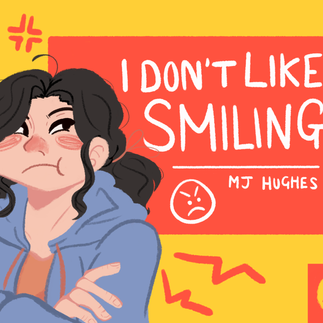
MAKING OF: 'I Don't Like Smiling'
- mjhughescreative
- Nov 14, 2023
- 9 min read


What is the 'Smile Project' ?
The 'Smile Project' was a creative project assigned in the final term of my first academic year at college. We were given a client brief, requiring us to create a project that promoted the benefits of smiling, however we could interpret this in whatever format we wanted to, using either graphic design skills, filmmaking skills, audio editing skills, or photography skills. In my case, I decided to create a children's storybook, as I felt that illustration and graphic design was one of my strong suits, and creating a storybook is something that I have always wanted to try.
THE PROCESS
PRE-PRODUCTION - The Research and Testing Phases
Illustrator Research, Factual Research & Design Inspiration
Before I could come up with the plot of the book, or begin designing the characters, I decided to do research into two areas: the benefits of smiling, and existing children's book illustrators (Sir Quentin Blake, Jane Massey, and Tove Jansson). By researching into the benefits of smiling, I could guarantee the information and facts provided in the book would be accurate, as well as give me ideas on how to incorporate these facts into the book. By researching into children's book illustrators, I could analyse their creative processes, alongside their individual art styles, which would help to inform the art style I chose when it came to illustrating the storybook.
After this, I created mood boards, as well as a Pinterest board, to help me to generate and visualise ideas. I gathered images from existing children's storybooks, such as page spreads and front covers, as well as character design sheets for children and cartoon expressions. Using this, I could begin to design the characters and start to come up with a plot to the storybook.
Designing the Characters
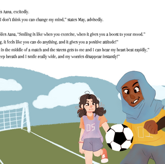
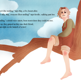
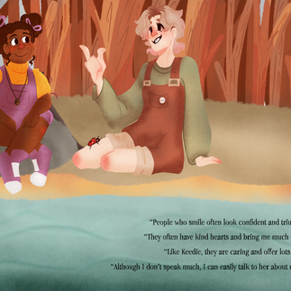
With the help of my mood boards, I began working on designing the characters. There are five characters in total, the two main characters, May and Keedie, and their three friends, Aana, Hayden, and Devon.
I created multiple sheets of design ideas for May and Keedie, beginning with an A3 sheet of pencil sketches, exploring their designs and expressions. Then, on another sheet, I used watercolours to test out colours for their designs, as well as using fine liners to test out various line weights. In comparison, designing Aana, Hayden, and Devon was a much simpler process, as I sketched and coloured their design ideas digitally and got their designs down in one try (I was very pleased with myself).
Through their designs, I wanted to use limited colour palettes for each character and attempt to convey their personalities through aspects of their designs, such as using shape language to differentiate each character. A fun detail I enjoy is that May and Keedie are designed to be opposites, which is visually represented in their designs, such as their hairstyles.
Furthermore, I wanted the characters to be diverse, so that children reading the book may feel seen and get excited to see characters that look like, act like, or have similar disabilities to them. For example, Keedie has a walking aid, Hayden is deaf and uses sign language and has hearing aids, and Devon has an autism badge on their pocket.
Writing the Plot
Overall, writing a children's book was quite a difficult process. As I am now more used to writing quite formally, writing a book trying to use words and generally get across facts and a story to a younger target audience was definitely quite challenging. I believe that the rhyming format that I have attempted would be quite appealing to children, making it sound catchy and fun to read. However, there may be an issue because some of the words can seem quite big but I believe this style of book would be one that adults would read to their children or would be distributed in primary schools for class reading, so it could also be seen for a chance for children to learn new words and expand their vocabulary.
Rough Draft
Before beginning to illustrate the book, I created a rough draft, using an older version of the dialogue to sketch the basic flow and ideas for how to visualise the text. I did this digitally, using Medibang Paint Pro on my Huion Kamvas 13 graphics tablet.
PRODUCTION - The Illustrating Phase
Illustrating the Storybook
Using my Rough Draft as a guide, I illustrated the storybook using Medibang Paint Pro on my Huion Kamvas 13 graphics tablet. I chose a simple, lineless art style and used bright colours throughout the book, aiming to attract the attention of the young readers. Overall, illustrating the book took me about a week of straight drawing. After I had finished illustrating the pages, I would then draw out the backgrounds (if the page required one). Then, once I had completely finished illustrating, I used Adobe Photoshop to put the pages together, adding in the text and making small adjustments (as well as doing small doodles, which can be seen throughout the book, looking like May and Keedie drawing on the pages with their respective coloured marker pens).
Illustrating the Front Cover and 'Happy Foundations' Logo
Once I had finished illustrating the book, I then used one of the illustrations to put on the front cover, editing the cover together on Adobe Photoshop, using various shape tools. Quickly, I came up with designs for the 'Happy Foundations' logo (the client for the brief) and then used my favourite one on the book covers.
CONCLUSION - A Collection of Weekly Reviews
Overall, the 'Smile Project' was my favourite project that I completed during my first year on my BTEC Level 3 Creative Media Practice college course, yielding results that I am still very proud of. In the future, I would like to have another go illustrating another children's book (either one that I write, or one that someone else has written), as the process was a fun challenge.
During the process of completing the project, I would write weekly reviews of what I had done, how far I had progressed, and then my next steps. Here, I have included my weekly reviews, giving you a better insight into the production of 'I Don't Like Smiling'.
Weekly Reflection - 08-12/05/23
This week, I have made progress with the Smile Project, as I have completed a majority of my written planning phase. At the beginning of the week, I completed my SWOT self-assessment and SWOT peer assessment regarding my chosen project response to the brief (a children's storybook). As well as this, I have finished writing a reflection based on what was said in these assessments. Next week, I will begin my practical planning phase, which will consist of concept sketches and designs, as well as experiments with different media forms, such as digital and traditional artwork. So far, I have not really encountered any issues, as I have only been planning my project.
Weekly Reflection - 15-19/05/23
This week, I have worked on multiple things, including research, plot planning and beginning to design characters. At the start of the week I did research on three children's book illustrators (Sir Quentin Blake, Jane Massey and Tove Jansson), looking at their life and their work to inspire my own creation of a children's storybook. As well as this, I researched the benefits of smiling, so that I would be informed when writing my story and could include accurate information. Later on in the week, I started writing plot ideas for my book, picking out and developing two ideas, before finally deciding between the two. Furthermore, I created a Pinterest board for design inspiration, which include the art style of the book, character designs, and book covers. Finally, I started sketching out designs for the book's two main characters (May and Keedie), on A3 cartridge paper. Next week, I aim to test out colours for May and Keedie, using watercolour to test out how that medium would look for my final illustrations, as well as design three of May and Keedie's friends and begin to think of book titles and the page layout for the book. The issues I encountered were fairly simple to overcome, such as initially struggling to think of designs for the two characters, however I created and used my Pinterest board to inspire me. Additionally, I struggled with coming up with plot ideas that would not result in a long book or bore children but, in the end, with time and thinking I eventually generated a plot idea I was happy with.
Weekly Reflection - 22-26/05/23
This week, I have worked on testing out colours for May and Keedie, using watercolours. As well as this, I have also worked on generating ideas for the title of my book, using spider diagrams to help and display this. Additionally, I have done some sketches to test out ideas for page layout and the flow of the story in a page format, using pens, pencils and paper. Finally, I have designed the three friends of May and Keedie (Aana, Hayden and Devon) in a digital format, completing my design work for all the characters featured in the storybook. Next week, I will decide on whether I would like to illustrate my final outcome in a traditional or digital style, generate design ideas for my book cover and 'Happy Foundations' logo, write the final story (text), and create a rough plan of how the pages and illustrations will look in the final outcome. My main issue this week has been generating ideas for the book title, as, initially my ideas were scarce and I struggled to come up with titles that were catchy or fit the plot. Like how I deal with most of my issues, trial and error was how I overcame this issue.
Weekly Reflection - 05-09/06/23
This week I have sketched out concepts for the design of the book cover, using a mix of pen and paper sketches and digital sketches. Additionally, I have created designs for the 'Happy Foundations' logo, drawing them digitally and finally deciding on a final logo design. Furthermore, I have written out the final text that will be featured in the final outcome and created a rough plan of how the pages and illustrations will look like and be placed in the final book, sketching this out digitally on Medibang Paint Pro. Next week, I will begin illustrating the final illustrations for the book, as well as beginning to illustrate the book cover. I encountered a few issues this week, such as picking a design for the 'Happy Foundations' logo, which I eventually chose with some consideration. As well as this, writing out the text for the book was quite challenging because of trying to pick words and phrases that children would like and be able to read, which I overcame by looking at other children's books and altering some word choices to simplify them.
Final Reflection - 23/06/23
I have now completed my children's book ("I Don't Like Smiling."), as a response to the 'Smile Project' brief and I have learned a lot from this process.
This week (19-23/06/23) was spent purely illustrating the book, up until it being edited together on Friday, using Adobe Photoshop. I sketched and coloured my illustrations digitally, using Medibang Paint Pro, and created all of my illustrations (mostly) without backgrounds. When it got to the editing phase, using Photoshop, I assembled my text and images (to get an idea of the layout) and then I went back into Medibang Paint Pro and illustrated the backgrounds based on the text placement. However, I did not always create my backgrounds in Medibang Paint Pro, as I simply used the shape and brush tools on Photoshop for the simpler backgrounds.
I encountered a few issues, which were mostly technical. Initially, I had issues with saving and recovering my illustrations, however I discovered that multiple files were created and I merely just deleted the old files. As well as this, I had issues with Photoshop, as it would not let me use the tools properly, due to a storage issue (which I fixed by deleting unnecessary files on my PC).
Regarding the final outcome, it is clear that a few changes were made that deviated from the planning. These changes were made for a few reasons, such as time constraints and limitations, optimal layout and artistic inspiration. For example, I decided to split up Page 10 and create an eleventh page, purely because I believed that the build up to May smiling would be better and the illustrations would look much better on their own pages, as the clutter of the two illustrations on the same page would take away from the impact.
If I had more time, I would have liked to create extra content for the book, such as proper digital character drawings for each of the characters and an extra poster to go alongside the book, as well possibly get the chance to print out the book. I have organised the pages in order of appearance on this page, as well as make a Microsoft PowerPoint consisting of the pages (alongside page-turning transitions, in an attempt to create a book effect). To push myself further, challenging my skills in audio production and editing, I could have also possibly created an Audiobook reading of "I Don't Like Smiling."
As a result of this project, I have learned new skills and developed my current skillset. By spending so much time illustrating and editing, I have learned to better navigate both Medibang Paint Pro and Adobe Photoshop, better understanding and learning how to use certain tools, such as learning how to navigate the layers system and adjusting the brushes on Photoshop (something I have not fully understood before). Furthermore, I have taught myself a new 'lineless' art style, something I have never properly executed prior to this project, and I guarantee I will use it again, whether it be for future projects or my own personal artwork. I have learned aspects of the creation and illustration of children's books and I believe all the skills I have learned and developed during this project will be beneficial in the future, perhaps giving me an insight into the possibility of pursuing illustration after the course.


Comments